Don't miss the chance to work with top 1% of developers.
Sign Up Now and Get FREE CTO-level Consultation.
Confused about your business model?
Request a FREE Business Plan.
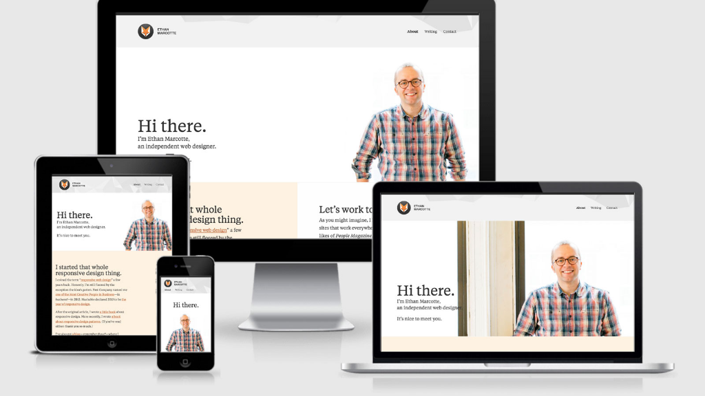
Responsive Web Design – Not An Option But a Necessity!

The advent of mobile devices has really created a convulsion in the internet’s arena.
A set of designing codes and layouts that were once thought to suffice when only one or two platforms existed, soon started proving nowhere near enough!Indeed it was brain-racking stuff until Responsive Web designing announced itself to the center-stage.
“Responsive Web Design refers to the ability of the content to shape and size itself as per the needs of the platform”. This approach to web-designing has eased the headaches of many a designer and developer around the world.
Why Responsive Web Design?
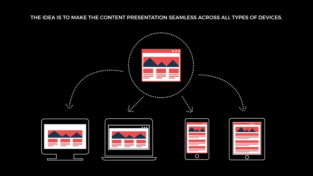
With the number of mobile-devices proliferating at a rate of knots, web-responsiveness proves to be a life-saver.Herein, developers could easily implement one set of code to work on several different platforms.A fixed design for a website just doesn’t cut it. So the idea is to make the content presentation seamless across all types of devices.
Responsiveness isn’t just performed for the mobile devices, it’s done for the desktop systems as well. Maximizing, minimizing and adjusting your browser window as per your needs is a fine example of responsiveness itself.Expert Web app developers are always harping on about how significant Responsive Web designing is to stay ahead in the competition.A number of Mobile App Development companies have emphasized the importance of Web Responsiveness as well.
Content that’s Flexible
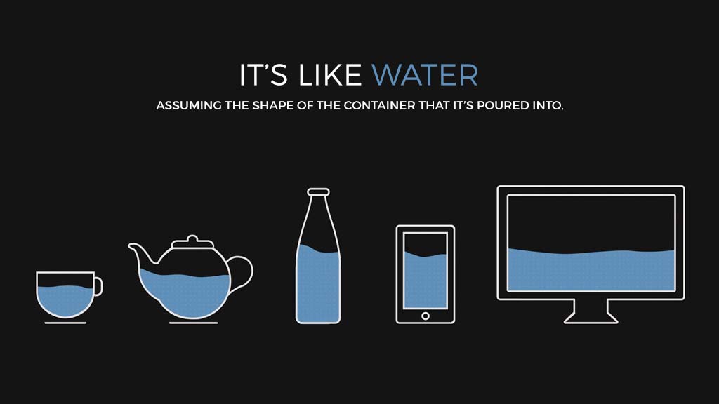
Responsive Web designs offer optimum fluidity. Whatever the type of content, responsiveness ensures it molds itself to the device’s native screen resolution.It’s like water, assuming the shape of the container that it’s poured into.Web responsiveness is very crucial from a business’ point of view as well. Anything a business has to offer, it should make its customers apprised of that.So you’ve gotta make sure that your website is Responsive not just to mobiles, but also to assorted different browsers.
Mobile app developers understood the value of responsiveness long time ago.It’s no surprise that people have their own favorites when it comes to web-browsers.Be it Google Chrome, Mozilla Firefox, Safari or IE, a responsive website ensures that it adapts to the browser’s needs automatically.For similar reasons, a web app development company would vouch for Responsiveness.
Spread the word, keep people coming in!

Since mobiles are the norm these days to get hands-on the recent events around the world, it makes sense to have your mobile websites responsive.
Whatever new products, services, news your business has to offer, responsive websites act as the perfect conveyor of information for you!The value of providing optimal user experience can’t be emphasized enough. Web Responsiveness goes a long way in delivering just that.
One Website, Minimum Cost

Then there is the cost aspect. There’s no doubt that it costs more to maintain separate websites for different platforms than one that adapts to the needs of the device.Furthermore, websites designed primarily for mobiles can prove to be a bit of a bother for web-users.They lack all the modern navigational techniques that traditional websites are capable of rendering.Keeping up with two different web addresses could also annoy your users as well.There’s a good chance they’d consider turning to your competitor if they offer a Responsive Website!Not just that, when it comes to SEO, it makes more sense to have one website and concentrate all your efforts towards it.
The Weightage of Googlex
Google, not just the most popular search engine worldwide, but an ultimate authority in web-development conventions also backs Web-responsiveness.Why? All responsive design sites contain a single URL and HTML.That immensely helps Google in its crawling, indexing and organizing of web-content.On the contrary, if a website has two versions, i.e. one for the mobile and another for the desktop, it doubles the Google’s task of organizing content.It’s no wonder that Google backs this smart approach to Web-Designing.
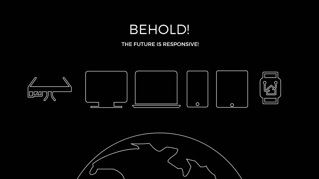
Behold! The Future is Responsive!
So it’s evident that Responsive Web-Designing is the new order in Web Development.If your website is not responsive, and still maintains different versions for mobile and desktop, then now is the time to definitely think about it.Technologies keep evolving and to keep up the pace with them, it’s crucial to acclimatize your methods! Web-Responsiveness is undoubtedly one such designing revolution.
To embrace it is to work towards the promise of delivering optimal internet experience irrespective of the device.That job has been made easier off late. Most of the templates and themes that are implemented nowadays are designed with Responsiveness in mind.
Rate this article!
(1 ratings, average: 5.00 out of 5)
Join 60,000+ Subscribers
Get the weekly updates on the newest brand stories, business models and technology right in your inbox.

Apptunix is an excellent goto solution based app development company with extensive experience in designing and developing any kind of app. The expert team of developers and designers at Apptunix bring forth the best possible solution to all your business app needs.


App Monetization Strategies: How to Make Money From an App?
Your app can draw revenue in many ways. All you need to figure out is suitable strategies that best fit your content, your audience, and your needs. This eGuide will put light on the same.
Download Now!Subscribe to Unlock
Exclusive Business
Insights!
And we will send you a FREE eBook on Mastering Business Intelligence.