Don't miss the chance to work with top 1% of developers.
Sign Up Now and Get FREE CTO-level Consultation.
Confused about your business model?
Request a FREE Business Plan.
Using Media Queries To Best Effect For Responsive Design

Responsive websites are no longer a choice but a necessity to keep your online presence strong and on the right track. We’re seeing a flood of new devices now entering the market fairly frequently. So now the websites aren’t just viewed on the traditional desktop screens but on laptops, smartphones and tablets and they all come in different sizes and screen resolutions. A Responsive website ensures that the user gets the same experience irrespective of the device or the browser. It helps to think of responsive in terms of water, i.e. water doesn’t have any form, it acquires the form of the container that it’s poured into. A responsive website works in a very similar way.
Responsive Vs Mobile Friendly
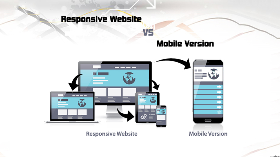
Most people tend to think that Responsive and Mobile Friendly are one and the same concepts and often use the terms interchangeably. But, there are some differences that one needs to be aware of:
The main difference between the Responsive and Mobile Friendly is that the former offers a highly customized mobile experience. Here, the text and images change from a three-column layout to a single column display. The navigation is condensed and images are optimized. On the other hand, with a mobile-friendly design, the user gets a ‘consistent’ website experience on all devices. The navigation is simplified and images are displayed smaller.
The other difference is obviously that Responsive requires a lot more work and expertise in comparison to Mobile Friendly.
Some Key features of the Responsive Website: –
1. Manages padding and margin
2. Fits on every device.
3. Optimized images
4. Easily accessible on every device.
5. Dynamic content that changes as per the device.
What’s A Style Sheet?
In brief, Stylesheet is a collection of style rules that tells a browser how the various styles need to be applied to the HTML tags to display a webpage or a document. There are 3 types of Stylesheets:
Internal or Embedded
Inline
External or Linked
In the context of Responsive, only Internal and External stylesheets remain a concern. So which is the best for defining media query?
First thing first, a media query is a CSS3 module that allows for content rendering to adapt to screen resolution and similar conditions.
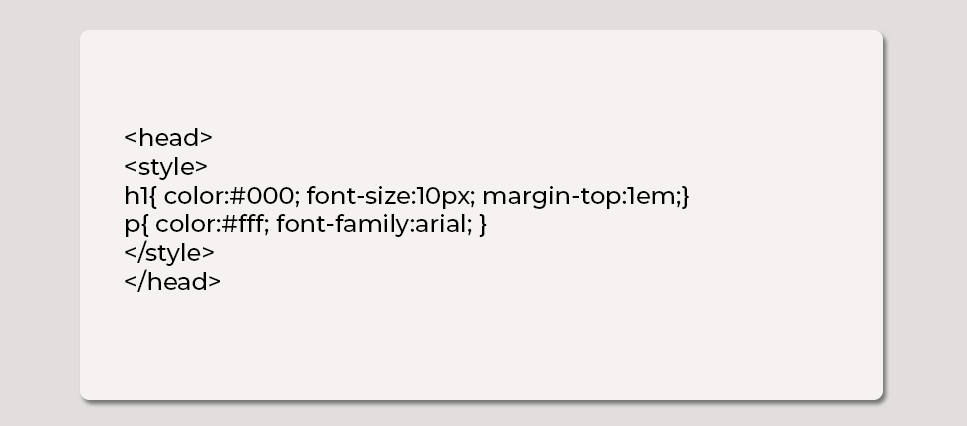
Internal Stylesheet
Internal style sheet should be used when there’s a unique ID of a single style. Internal styles should be used in the head section, by using the tag, like this:
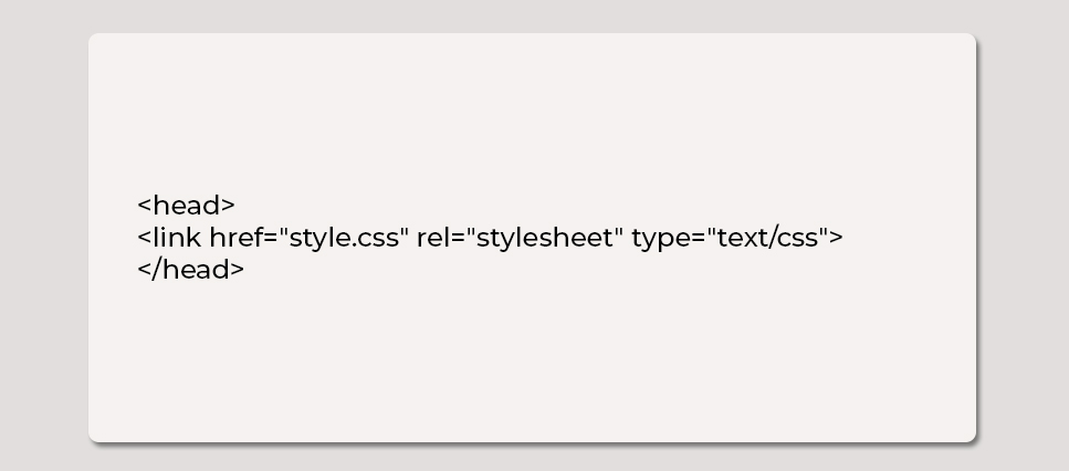
External stylesheet
External stylesheet should be used when the style needs to be applied to many pages. With an External stylesheet, we can change the whole look and feel of the entire Web site by making changs in one file. External style sheet is linked with each page using the tag and the tag should be in head section:
So, Which Is Better To Use
One of the best things about Style Sheets is that you can use them to keep your site consistent. As for which style sheet is the best, the answer has to be the External Style Sheet. Its application is quite easy. One just has to either link or import it to get the website going. Here are some more plausible benefits of using External Style Sheet.
1. The styles of multiple pages can be controlled with one file.
2. Easier to maintain larger websites.
3. A single can be used to change the look and feel of the whole website.
4. Page loading speed is increased once the main CSS file is cached.
5. Lower bandwidth usage.
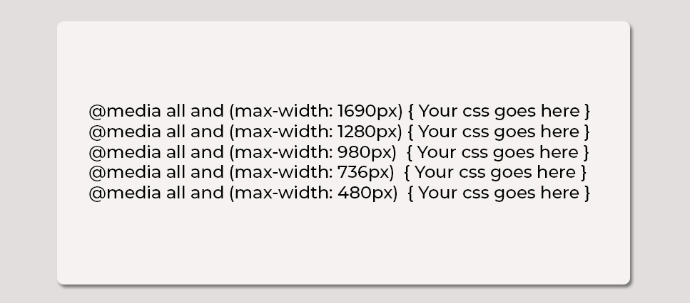
Media Query Breakpoints
Breakpoints are the points on which your website layout should be resized according to the device. When you start work on Responsive design you will describe your breakpoints at the accurate device-width that you’re looking to target.
The main approach is to go ‘Mobile First’. That means that your CSS will aim at small screens.
Standard Breakpoints list:-
Final Thoughts
With media queries, you can simply focus on specific screen size and build a strong user experience irrespective of the kind of browser or device is used to view the website. These skills are at the heart of the responsive design which includes mobile, web design and development execution.
If you consider it, Responsive design isn’t all that difficult to use either, yet its benefits far outweigh any difficulties that might be holding one back from learning it. It allows the web designers to build affable layouts that smartly size and shape themselves to fit on various devices or screen sizes.
There’s no rocket science involved in trying media queries on your website. Give it a go and let us know your experience.
Rate this article!
Join 60,000+ Subscribers
Get the weekly updates on the newest brand stories, business models and technology right in your inbox.

Apptunix is an excellent goto solution based app development company with extensive experience in designing and developing any kind of app. The expert team of developers and designers at Apptunix bring forth the best possible solution to all your business app needs.


App Monetization Strategies: How to Make Money From an App?
Your app can draw revenue in many ways. All you need to figure out is suitable strategies that best fit your content, your audience, and your needs. This eGuide will put light on the same.
Download Now!Subscribe to Unlock
Exclusive Business
Insights!
And we will send you a FREE eBook on Mastering Business Intelligence.


