Don't miss the chance to work with top 1% of developers.
Sign Up Now and Get FREE CTO-level Consultation.
Confused about your business model?
Request a FREE Business Plan.
How to Make Sparky App Icons and Screenshots

A smartphone app is a mix of many things, however, roughly it’s seen as technology blended with artistic flair.An app is not just a means to perform some meaningful operation. But instead how it lets you perform that operation, i.e. its whole approach and journey tell a story in itself.
So when so much grit, imagination, thought-process and time is invested in creating an app by a mobile app development company, it’s only fair that you ensure it finds its way to the people for whom it’s intended and in a way as you’ve meant it.
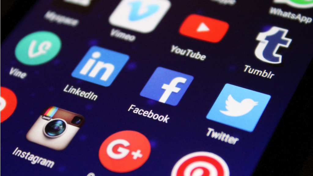
So how is your app received first up? It’s received by its name, logo, icons, and screenshots.
Thus, you have to be at the top of your game when crafting these important elements as they can decide the app’s fate in a matter of moments.Let’s examine in depth what it takes to make your app’s icons and screenshots, practically the face of your app, awe-inspiring and flawless.
Make it Clear, Make it the Best

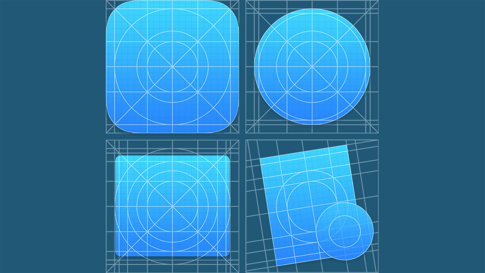
The icons that you’d be using in your app have to be ultra-clear and should be ‘meaningful’.There’s no point in using something that doesn’t say anything about your app’s purpose or something that your audience and clients can’t relate your app to.Every iOS app development company is wary of this:
“For example, an app that helps you find car repair shops close by could use a magnifier focusing on an image of a car and some repair tools. Magnifier is used to have a closer look at something or simply to find something thats not visible to the naked eye, whereas the car and repair tools are self-explanatory.”
Anyone should be able to tell that the app has to do with car repair finder.Mostly, it’s the functionality and purpose of the app that’s has to be justified through the icon.But for some apps that have around for a long time, their history and achievement could also be given a thought. Something for accomplished mobile app developers to ponder on.
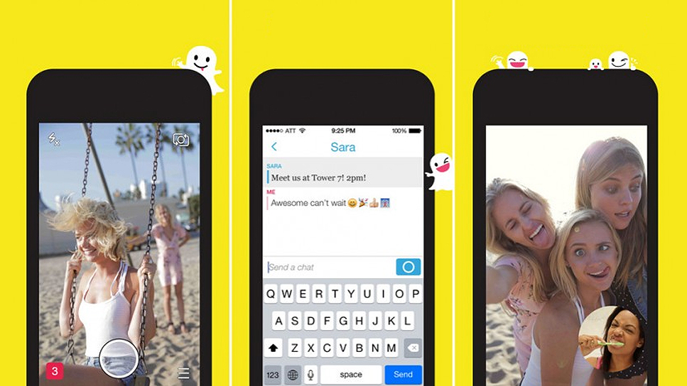
If you have a convincing way to portray everything in an icon, then all well and good, but be careful so as not to make the icon too ambiguous or too complex to understand.When it comes to screenshots, you don’t have to go too far from the truth.You could play around with the outlines and such but still have to show the actual screens that user will see in the app.Don’t show something that your app doesn’t have. Mobile users have a short temperament and they wouldn’t think too to label you a cheat.
Originality is a Must

The app markets are replete with apps. There’s always an app for something whichever category you’re looking into.So it’s very likely that your app will already have some substitutes in the Play Store. Your challenge – how do you stand out from the rest?
The answer lies in originality and creativity. Nothing wrong in attempting something that’s not out there.Your icon has to embellish the app’s idea – you could demonstrate the uniqueness in the use of the identifiers, their shape, and sizes.
For the car-repair finder example previously mentioned, you could play around with the type, color and shape of the magnifier and really show a fancy looking car in the focus with the various paraphernalia used in car repairs.
Again, when it comes to screenshots, every mobile app development company, has to do justice to the app’s icon or you’re letting the users as well as the app down.All the distinct features and specialties of the app should be manifested through the app screenshots.So use original screenshots to be on the safer side.
Flamboyancy – A Shaky Proposition
As mentioned earlier apps are often thought to be a means to express your creativity. No doubt, there is room to exhibit your creative side, but do proceed with caution.This move isn’t that straightforward at it may seem at first and can easily prove costly if you get it wrong. But there’s only one way to find out if your creativity is worth it i.e. by putting it to test. Play around, get the juices flowing, crank up a thing or two and give in the best shot that you’ve got.No need to test screenshots with any sort of flamboyancy. Showing the app’s main functionality and how it operates is the prime focus here.
Quality Matters

The digital age is well underway and we’ve all developed a hankering for viewing everything in high-definition.Why then should the icon of your app have a bland a low-key appearance?Display it in all its glory. To stay assured of the quality of the app, you don’t have to look too far from the various image-editing software that seems to be coming out with cool and exciting features every new release. Most of the software is freely available, albeit with limited features or supported by ads.
Once you have your hands on one of these software, you shouldn’t be too far from creating eye-catching icons with superior quality.Top-notch quality is just as important for screenshots as it’s for the icons. An illustrious iPhone app development company is known for the use of its grade-A quality for the icons.
You’d just have to be careful with the screen’s size and appearance depending on the device you’d be making them for.Borders are simply not needed when you’re creating screenshots exclusively for a mobile-intended audience.
Liven Things Up a Bit
Acting on the tips mentioned in this article will help you make the ideal icons and screenshots for your app.But you can’t afford to rest on your laurels once you have them ready.The images that your app is associated plays a crucial role in your overall app’s success.Users gravitate towards quality and chic looking images. So mobile app developers can really shake things up a little and give something the users want to see in their apps.
Give Everything You’ve Got!
The competition in the app stores is so fierce that despite your utmost best efforts you can’t expect to gain recognition easily.You really have to take the bull by its horns set your own stamp of authority on what you’re doing.
At App Stores, audacity isn’t all discouraged. The point is that it has to be justified and in a proper place.Your own brilliance could set a precedent for other apps in the same category.Crafting the most sumptuous kind of icons and screens may require you to rack your brains for some period of time, but when you do nail it down, it’s going to be an amazing feeling ever!
Rate this article!
Join 60,000+ Subscribers
Get the weekly updates on the newest brand stories, business models and technology right in your inbox.

Apptunix is an excellent goto solution based app development company with extensive experience in designing and developing any kind of app. The expert team of developers and designers at Apptunix bring forth the best possible solution to all your business app needs.

App Monetization Strategies: How to Make Money From an App?
Your app can draw revenue in many ways. All you need to figure out is suitable strategies that best fit your content, your audience, and your needs. This eGuide will put light on the same.
Download Now!Subscribe to Unlock
Exclusive Business
Insights!
And we will send you a FREE eBook on Mastering Business Intelligence.


